

The Modern Brand
The Modern Brand is a small advertising agency located in Birmingham, AL. With a team of under 10 people, it was always a sticking point to create a website to be proud of that showcases work that represents the agency well. I was the sole UI/UX Designer on the team and designed several websites for them over the years. In 2019, I created & implemented a web design process for us to use on all of our websites and started with ours.

Homepage of finished site.
The Problem
As a designer, I know how hard it is to design something for myself. This was always an issue at The Modern Brand in my nearly 5 years there. Since we were a small agency, sometimes egos could get in the way. In order to create something that would accomplish the goal of showcasing our best work while creating a beautiful website, I worked very closely with the team’s graphic designers & our company’s founders.
The Process
Something that needed to be done in general was establishing a web design process to be used on all of our client’s websites. Who better to try it on than ourselves? With my knowledge of UI/UX best practices & what could feasibly work for our team, I developed a web design process that would help lead us to the best possible result.

First pages of the web design process.
With our new web design process in mind, I began working with our graphic designers to create our website from the ground up. We all did our separate research, came together with inspiration, and talked through what goals we wished to accomplish with the website.
Something that we all agreed on right away was the need for the website to be low-maintenance and clean. That starts with how many pages are on the site as well as what is chosen to be shown on those pages. I talked with the stakeholders - in this case those were our company’s two founders - and got a list of projects that they felt represented our brand the best. From there, I made a site architecture to present to the graphic designers.

The Modern Brand Site Architecture
After presenting the site architecture to the two graphic designers, I began creating wireframes. There were a few iterations of the homepage design, including the one shown below, but we ultimately landed on it being just a logo animation created by one of the other designers and a button to enter the site.

Initial homepage wireframe
Once we landed on what the homepage design should be, we began talking about the rest of the site. We worked together white-boarding every page after this. I gathered all of the assets from the designers, with our best work to show for each client. Once I got everything from them, I created low-fi mock-ups for the copywriter to refer to when writing her copy. We wanted to keep the copy concise to reflect the clean look & feel on the rest of the site.

Mock-ups with space for copy.
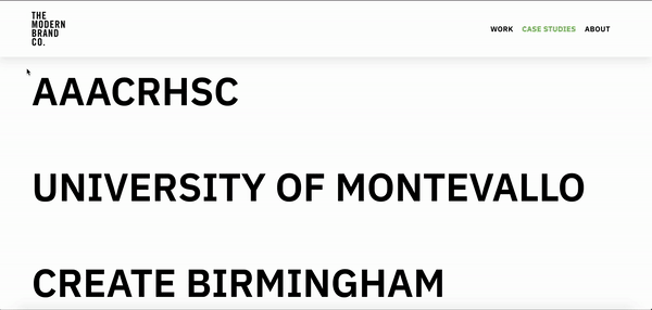
While we were keeping the website clean & simple, I worked to inject small moments of color. I kept with The Modern Brand’s green on everything that came with our brand, and added custom CSS to moments that were for our clients. When a user hovers over each name of the client on the “Work” or “Case Studies” page, the title will become the main color that corresponds to that client.
I also used my knowledge of HTML, CSS, and JS to inject custom code to create various effects throughout the site, including the shadow under the header menu.
The final piece of the puzzle was to photograph everyone for their headshots. Using my fine arts degree, I staged, photographed, and edited everyone’s headshots. I also injected custom CSS and JS to create the hover effect over each person’s headshot to list their name & position.

The photo grid
In Conclusion
This project was such a team effort. I learned so much from beginning to end, from implementing our much-needed web design process to figuring out the best way to inject small moments of delight to the design. If I could change anything about the existing design, I would possibly add more context for the user on the “Work” and “Case Study” pages, and a better way to contact the agency itself.
Overall, I’m really content with what was created. It’s beautifully clean & gets the feel of “The Modern Brand” across to the user.